Chicago Dough Pizza Company
Problem:
Chicago Dough Pizza Company has been making gourmet Chicago-style pizza since its opening in 1976. Operating in the Chicagoland area for over 40 years, the three locations in Richton Park, Bourbonnais, and New Lenox. Although their current identity can be seen as somewhat nostalgic, a more modern look is needed to stand out amongst other competitors in the city famous for its pizza.
Solution:
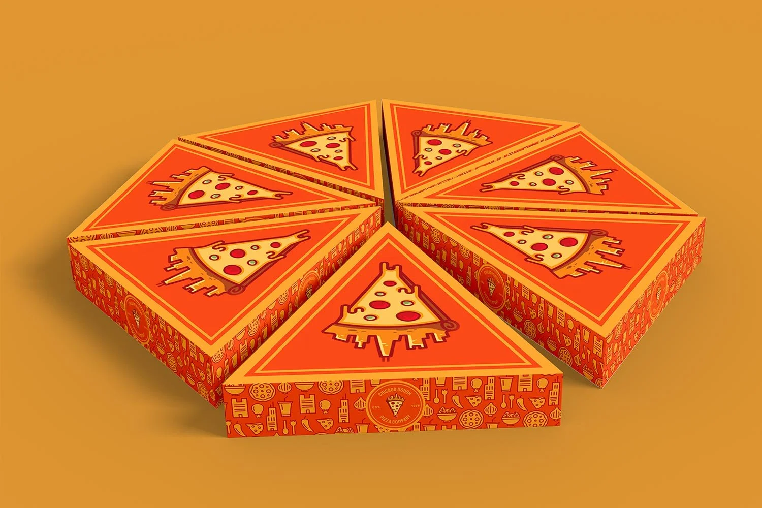
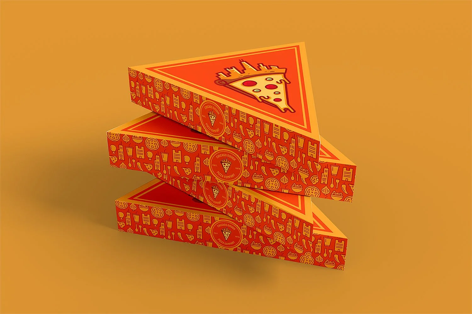
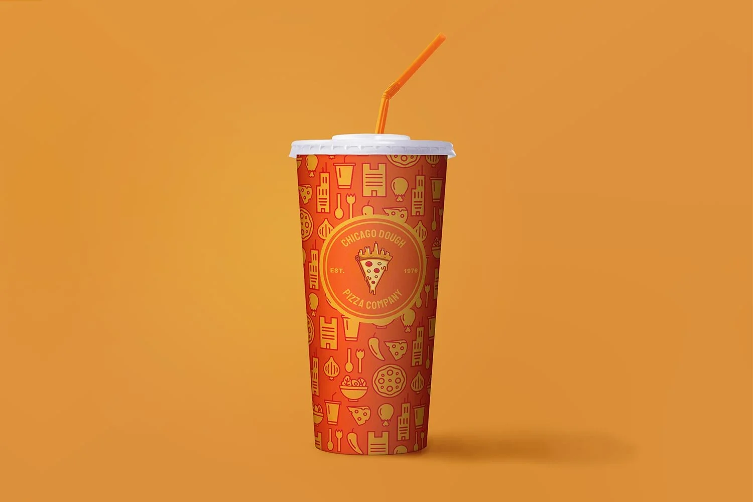
For this visual identity, I combined the components of pizza dough and the Chicago skyline to create a new logomark for Chicago Dough Pizza Company. The tall condensed typography was chosen to reflect the tightly packed buildings found in the city. The truck wrap and packaging included a pattern comprised of different Chicago skyscrapers, pizza ingredients, and other items one might find when visiting Chicago Dough. I also incorporated bright, warm colors that were meant to be reminiscent of colors found in pizza.
logomark
primary lockup
logo components
iconography
color palette & typography


